You might also like:
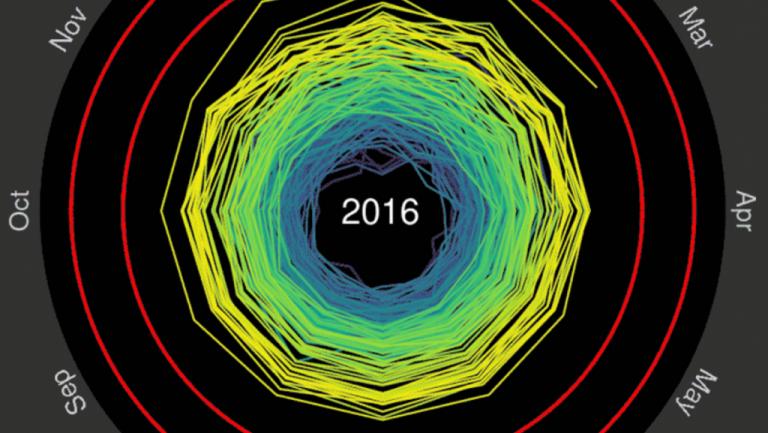
Spiraling global temperatures, 1850-2016.
GlobalPost/Ed Hawkins/Courtesy
You get the picture. Our planet is getting hotter. Fifteen of the 16 hottest years on record have come since 2001, NASA says. Climate scientists warn that effects for the Earth and humanity will be catastrophic if the global average temperature rises by 2 degrees Celsius above pre-industrial levels. Some say even 2 degrees is too much, and that humans need to hold the temperature increase below 1.5 degrees.
That’s why those two figures, 2 degrees and 1.5 degrees, were at the center of the Paris climate deal, which 195 nations agreed to in December. Those nations have pledged to keep the global temperature increase to “well below” 2 degrees, while aiming to hold it below a 1.5-degree increase, in recognition that the lower number “would significantly reduce risks and the impacts of climate change.”
That leaves us with the question: How far along are we already? Luckily, there’s a GIF for that.
[tweet id=”729753441459945474″ align=”center”]
The graphic, created by Ed Hawkins, a climate researcher and professor in the University of Reading’s meteorology department, visualizes monthly global temperatures from 1850 to 2016 as a series of rings spiraling out toward those two key threshholds: 1.5 degrees and 2 degrees.
Each ring represents one year. Hawkins uses as a baseline the average annual temperature between 1850 and 1900, the same pre-industrial average used by the United Nations Intergovernmental Panel on Climate Change (IPCC) in its most recent assessment (Hawkins was a contributing writer). The animation’s data comes from the HadCRUT4 global temperature dataset, which is maintained by the Climatic Research Unit at the University of East Anglia and the Hadley Centre at the UK’s national weather service, the Met Office.
The resulting spiral is a simple, elegant illustration of a dark history and a potentially terrifying future.
“The animated spiral presents global temperature change in a visually appealing and straightforward way,” Hawkins explains. “The pace of change is immediately obvious, especially over the past few decades. The relationship between current global temperatures and the internationally discussed target limits are also clear without much complex interpretation needed.”
If the spiral doesn’t suit your brain, Hawkins provides other ways to visualize the same data.
[tweet id=”727920589814517761″ align=”center”]
And there’s always this time-lapse heat map from NASA. It’s pretty much the dataviz gold standard when it comes to animating our ongoing climate catastrophe.
by Timothy McGrath, PRI’s The World
This article is syndicated from GlobalPost.
Source: matadornetwork.com
